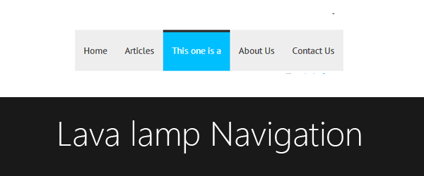
A few post before I shared how to create a dynamic tab with a lava lamp but,that dynamic tab consist of technique which is not a developer friendly.As developer want that lava lamp resize and moves according to the element.This time I got something that people love to add,its a lava lamp navigation menu that changes its position according to element and resize automatically.
For more,I have a snippet that can be added by Blogger users to change their normal pages widget of Blogger into a lava lamp navigation.So lets start with it:
Demo
These instructions are for non Blogger users,for Blogger users the instructions are below.
HTML
<nav>
<ul>
<li><a href='#'>Home</a></li>
<li class='selected'><a href='#'>Articles</a></li>
<li><a href='#'>This one is a</a></li>
<li><a href='#'>About Us</a></li>
<li><a href='#'>Contact Us</a></li>
<li class='lamp'></li>
</ul>
</nav>
class selected to a listing element,it is just for demonstration,the class selected will be added to that element of which the page is opened,means active page.Secondly,li with a class lamp has been added that is actually the lava lamp which moves.Jquery
$(function () {Firstly,if the
if ($('nav ul li').hasClass('selected')) {
$('.selected').addClass('active');
} else {
$('nav ul li').first().addClass('active');
}
var currentleft = $('.active').position().left + "px";
var currentwidth = $('.active').css('width');
$('.lamp').css({
"left": currentleft,
"width": currentwidth
});
$('nav ul li').mouseenter(function () {
$('nav ul li').removeClass('active');
$(this).addClass('active');
var currentleft = $('.active').position().left + "px";
var currentwidth = $('.active').css('width');
$('.lamp').css({
"left": currentleft,
"width": currentwidth
});
});
$('nav ul li').mouseout(function () {
$('nav ul li').removeClass('active');
if ($('nav ul li').hasClass('selected')) {
$('.selected').addClass('active');
} else {
$('nav ul li').first().addClass('active');
}
var currentleft = $('.active').position().left;
var currentwidth = $('.active').css('width');
$('.lamp').css({
"left": currentleft,
"width": currentwidth
});
});
});
class selected is present then the class active will be added to it,if it is not present then the first element which is mostly home,will have class active.Then width and the position to left will be calculated by variables that are currentleft and currentwidth.As the mouse enters to any element,the class active will be added to that element and the lamp will move towards it.Due to CSS3 transitions,the lamp will have a linear motion.Finally,when the mouse will be out then the element with
selected class (if present) or else first element (usually Home link) will have class active and the lamp will back to it. For Blogger Users

This tutorial is for Blogger users.
I love to go native and love Blogger.This is the reason I've chosen this tutorial to be shared.Before I did shared a tutorial that how to change a Blogger pages navigation into a responsive menu when it is a small screen size.Now this time its a bit cool stuff for you.
To change the Blogger navigation,into a lava lamp navigation just you have follow three steps.Before that make sure that this script will only work on Blogger's pages widget and you must backup your template first.If you want to create your own navigation menu then use the above method.
1.Add Jquery
Add the
Jquery if it is not present in your script.To add Jquery,add the following line just after <head><script src='//code.jquery.com/jquery-1.10.2.min.js'/>
2.Add CSS
Add the following code just before
]]></b:skin>.PageList ul {Replace the following:
position:relative;
list-style:none;
padding:0;
margin:0;
}
.PageList ul li {
float:left;
}
.PageList ul li a {
padding:25px 15px !important;
background:#eee !important;
color:#333;
display:block;
font-family:'PT Sans', sans-serif;
text-decoration:none;
}
.lamp {
position:absolute;
height:4px;
background:#333;
transition:all .3s linear;
-o-transition:all .3s linear;
-moz-transition:all .3s linear;
-webkit-transition:all .3s linear;
}
.PageList ul li.selected.active a, .PageList ul li.active a {
background:#00bfff !important;
transition:all .3s linear;
-o-transition:all .3s linear;
-moz-transition:all .3s linear;
-webkit-transition:all .3s linear;
color:#fff !important;
}
- #eee with the background color of the link.
- #333 with the color of the link.
- #333 color of the lamp.
- #00bfff for the background color of the hover or selected page.
- #fff for the color of the hover or selected page.
3. Add Javascript
Add the following code just before </head>
<script>Save settings and have a look on it.
$(function () {
$('.PageList ul').append("<li class='lamp'></li>");
if ($('.PageList ul li').hasClass('selected')) {
$('.PageList ul li.selected').addClass('active');
} else {
$('.PageList ul li').first().addClass('active');
}
var currentleft = $('.PageList ul li.active').position().left + "px";
var currentwidth = $('.PageList ul li.active').css('width');
$('.lamp').css({
"left": currentleft,
"width": currentwidth
});
$('.PageList ul li').mouseenter(function () {
$('.PageList ul li').removeClass('active');
$(this).addClass('active');
var currentleft = $('.active').position().left + "px";
var currentwidth = $('.active').css('width');
$('.lamp').css({
"left": currentleft,
"width": currentwidth
});
});
$('.PageList ul li').mouseout(function () {
$('.PageList ul li').removeClass('active');
if ($('.PageList ul li').hasClass('selected')) {
$('.PageList ul li.selected').addClass('active');
} else {
$('.PageList ul li').first().addClass('active');
}
var currentleft = $('.PageList ul li.active').position().left;
var currentwidth = $('.PageList ul li.active').css('width');
$('.lamp').css({
"left": currentleft,
"width": currentwidth
});
});
});
</script>
Last Words
I want to describe each and every thing of the post in detail but if through out the tutorial if something you didn't get,then we are waiting for your comments.


Post A Comment:
0 comments: