Responsive Design,the most spreading topic among designers.The site owners wants their site to be like an ATM,only insurance for responsive design is not enough,we need responsive ads.Google Adsense to be the world's largest ad provider provides a responsive ad unit for their publisher.
This article is all about how can you make most of responsive ad units by adding different codes.Previously I've shared a post related to adding advertisement between post,you should read that to make your ads more useful.
To make a responsive design is not a big deal but it takes a lot of time,but what if your ads are not responsive.Responsive layout do not of overflow-x it means that their content doesn't overflow on the x-axis and leaderboard and other ad banners can do that.
Lets start by creating a ad unit by Adsense.
Steps
- Log in to Adsense.
- Click on My ads > Create a ad unit.
- Select a suitable name,in first field.
- Now in ad size,choose responsive ad unit.
- Then complete the form according to your needs.
- Then click on save and get code.
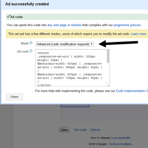
- Select Advance (code modification required) and copy code.
The code will be something like this one:
<style>
.responsive-ad-unit { width: 320px; height: 50px; }
@media(min-width: 500px) { .responsive-ad-unit { width: 468px; height: 60px; } }
@media(mix-width: 800px) { .responsive-ad-unit { width: 728px; height: 90px; } }
</style>
<script async src="//pagead2.googlesyndication.com/pagead/js/adsbygoogle.js"></script>
<!-- Responsive ad unit -->
<ins class="adsbygoogle responsive-ad-unit"
style="display:inline-block"
data-ad-client="ca-pub-XXXXXXXXXXX"
data-ad-slot="XXXXXXX"></ins>
<script>
(adsbygoogle = window.adsbygoogle || []).push({});
</script>
Why not Smart sizing?
Before further moving one let me tell you why did I choose Advance why not Smart sizing?
The smart sizing is a useful feature but their is a problem in that,the size of the ad unit will be changed according to screen size but not according to the outer element,it mean if you want a banner of 468 x 60px then it can show 250 x 250px or any other.It means the desired banner size will not be acquired.Hence better to choose advance and do some code modification according to your needs.
Back on code
Before proceeding their is post given by CSS-Tricks for media queries that have some major media queries of most popular devices have a look.
The only thing you need to change is CSS. It is a normal code of CSS which contain some media queries of different screen sizes.All you need to do is to change the min or max width of screen size and add your desire width and height of the ad banner.
One important thing you need to consider is to only give width and height of banner that is provided by Google adsense like 486px width and 60px height,it is a standard size of a ad banner.For all ad banner sizes provided by Google Adsense click here.


Post A Comment:
0 comments: